Is Your Fancy Accessible Website Usable for Disabled People? (And How to Self-Check)
Is your website usable for disabled people?
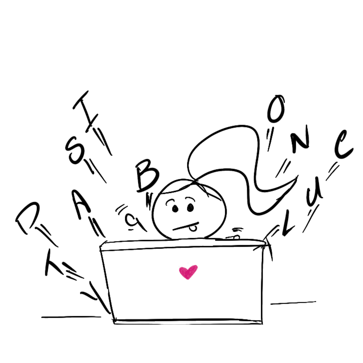
Let’s not tiptoe around it. We all get stuck with our website sometimes.
We think our artfully designed websites, with their bright colours and brand-defining fonts, are trendy.
But, when a person with a disability tries to use our website as easily as anyone else, it doesn’t work.
Sure, we could blame it on the website-building platform.
There was no pop-up accessibility wizard. The overlay accessibility plugin should do that. The web developers didn’t mention usability.
In reality, we’re puzzled about accessibility and usability.
We struggle with the guidelines.
We don’t understand the criteria.
You may wonder why.
So stick with me here if you want to learn more about how to make your accessible website usable for disabled people.
But, before I jump into the details let’s take a look at what an accessible website is.
What is an accessible website?
Did you know there are about 400 million active websites worldwide?
And, the crushing majority of them aren’t accessible.
In fact, 97.4% of homepages have detectable accessibility errors according to the 2022 WebAIM annual accessibility analysis of the top 1 million homepages.
Why is this important?
Because 7 in 10 disabled clients will find your website difficult to use.
Sigh.
An accessible website is like rain on parched flowers, a long-awaited welcoming place for people with disabilities, impairments, and limitations.
Specifically, it guarantees people:
- who are blind
- with learning disabilities
- with cognitive disabilities
- who are deaf/blind
- with speech, and
- physical disabilities
the opportunity to recognize, understand, navigate, and interact with your website using assistive technology.
Keep in mind, this is possible only if you provide:
- alt text for images
- logical heading and content structure
- access to forms
- access to pop-ups
- use of ARIA to provide greater context
- meaningful links describing their purpose
- availability of skip links
- visible focus inclusion
- colour contrast
Now, the above examples are part of the Web Content Accessibility Guidelines (WCAG).
And yet, here’s something I learned from creating my own website.
The standards of the Web Content Accessibility Guidelines are technical. This means they make sure the code that drives your website can be accessed by assistive technology.
But, here’s the problem.
Because the web accessibility guidelines deal with website structure, it doesn’t mean that your visitor will have a sunshiny experience exploring your website.
This is also the reason accessibility overlays promising a quick fix for your website’s accessibility issues, don’t work.
How can you be sure?
Self-check: Is your website truly usable?
Imagine sitting at your desk trying to book a flight. You start dreaming about your seaside holiday. You’re yearning to soak in the sun. You click on the website, open it up, and stare at the wall of jumbled text.
Huh?
It all looks the same.
All the letters are lowercase, there is no logical heading order to help you scan the content. Basically, all the things on the screen in front of you are as clear as mud. How long would you read through it before running away?
Sure, your website is following the Web Content Accessibility Guidelines (WCAG) and is accessible to a screen reader.
But, can a disabled person use it easily?
In other words, are they able to find all the information they are looking for?
Is the content on your website clear, easy to read, and understandable? Is their experience satisfying?
Inviting the lived-experience expert
I invited my friend Anna Maria who is blind, for a freshly brewed cup of coffee and asked her to use VoiceOver, the screen reader software on her iPhone to visit my website.
I’ll be straight up with you.
My face turned tomato red from the instant usability issues she found.
Let me show you.
Decorative Images
First, two pointless heart-shaped icons that confused her screen reader and an image of Basel City with no clear message or Alt text.
She advised to avoid pointless, fluffy, filler photos also known as decorative images and icons because they confuse disabled users.
Instead, we should use accessible images sending a clear message.
Hyperlinks
She found a broken navigation link leading to nowhere that made her feel like navigating a maze.
So checking your website for broken or hazardous links is important.
Finally, avoid having your links open in a new window or tab because it can be confusing for people who have difficulty perceiving visual content.
Graphics
Moving on, she came across inconsistency between content and graphics which was mind-boggling.
She reminded me to try and strike a balance between the two and split it into different web pages to make it clear.
Similarly, even though I prioritized audience-targeted web design and accessibility-friendly fonts, there was a lack of an accessibility-friendly keyboard that shuts out disabled users.
Page Loading Time
Love waiting?
Believe me, no one does.
My blog posts had a large volume of unoptimized photos which resulted in slow page loading time. This was chaos, making Anna Maria want to abandon my site.
She recommends optimizing and reducing the size of images and minimizing flash content.
Mobile Accessible Friendly
The days of desktop seem gone, and, my fancy website wasn't mobile-accessible-friendly.
The result?
A negative user experience and a decline in website traffic.
So, there you go. A list of usability tips to help you get around the problem of an accessible and usable website for disabled people.
But how can you ensure this doesn’t happen to you in the first place?
I suppose you could hire an expert web developer-designer.
But, what about asking the expert in disability?
Yes, a disabled person.
In my experience, the best results come from working with people who live with a disability.
Ready to Inject Your Website With Usability?
Imagine using a mouse to browse a website without seeing the cursor on the screen.
As we mentioned above, even the most jazzed-up site is useless to someone who cannot access its controls and interact with it.
Yes, a usable website is an accessible website.
But, an accessible website doesn’t always mean it’s usable.
Instead, the basis of a usable website is clean, clear, and responsive – something that everyone can get a hold on.
What’s next?
Each of our web accessibility paths will be unique, but the outcome will be the same. An accessible, usable website for people with disabilities.
Are you ready to get started?
Let's do this.
Are you worried your strategy is chug-chugging in place?
Grab my accessibility checklist straight to your inbox and automatically join Disability Tidbits—a bi-weekly newsletter packed with inclusivity tips to help you keep moving forward.