Want to Double Your Social Media Impact? Use This Simple Accessibility Tip

Imagine you've polished your next social media post.
You know who you're writing for. Your post is engaging. Your image is commanding. You click publish and breathe deeply.
You’re done.
But somehow things aren’t working.
You’re not getting the likes, comments, and support your post deserves. Your image isn’t sending the strong business message you’re hoping for.
What’s going on?
Then, you spot one of those epic, Jamie Shields (Registered Blind ADHD Rhino) posters about alt text, and you start to wonder… can alt text enhance your brand reputation, improve your SEO, and reach the customers you've been unintentionally ignoring?
In this post, you’ll learn:
- What alt text is and why it’s important
- A useful structure to use it
- Why it’s good for SEO
Are you ready?
1. Alt text in simple words
An eye-catching photo without alt text is like a dazzling room without light.
Nobody peeks into the room to see what’s inside. Nobody turns on the light to notice its charm.
So, if you want your social media images to be visible to a significant portion of your potential market (2.2 billion people worldwide with visual disabilities), promise them a generous vision.
Alt text.
Alt text (also called "alt attributes" or “alt descriptions") is the short text you see describing an image or a graphic on a social media post. Unlike image descriptions, alt text is added to an image tag in the HTML code of a webpage or through a platform’s designated alt text field.
How is it helpful?
Alt text allows screen reader software to read your image description aloud, so people who are blind or have low vision can understand what your image is about.
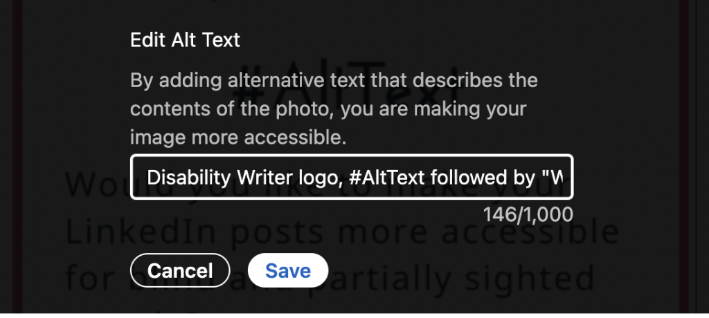
Here’s an example of an alt text field on LinkedIn.

What's the real cost of skipping alt text?
When you do this, you're unintentionally sabotaging your marketing goals.
Imagine paying for a billboard but leaving it blank for 15% of the cars that drive by. That's what happens when you publish an image without alt text.
Now, instead of delivering your message, your visual delivers a new one:
"This brand is not for you."
To a market segment with billions in disposable income, this is a clear signal to go to a competitor.
The good news is, you can use the alt text field to prevent this. It's built into every social platform you use and ensures your message is actually delivered.
A useful structure for writing alt text
You might think Alt text is for UX designers or social media experts. For accessibility authorities. Not for entrepreneurs like you and me. But that’s not true. Using Alt text is easy and it can help you engage with a wider audience.
How does it work?
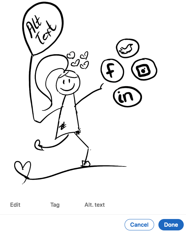
Depending on the social media platform you're using, as soon as you upload an image the option to add Alt text appears. This can be in the Edit Your Photo window, like in the image below.

Click on Alt text and write your description.
What should you aim for?
1. Keep it short
The purpose of Alt text is to provide an explanation of the image for those who can’t see it. Here’s an example:

OK alt text: <img src="Lia_Stoll.png" alt="Woman">
Good alt text <img src="Lia_Stoll.png" alt="Woman smiling"
Great alt text <img scr="Lia_Stoll.png"alt="Blond white woman with glasses smiling">
2. Be specific
It's easy to get lost when learning to use alt text, especially when LinkedIn gives you 1000 characters to play with.
Start off communicating in a clear, purposeful way, describing what’s important based on the context of your image.
Here’s an example with alt text in different contexts.

Alt-text with no context: Four people and a dog.
Alt-text on a page about recent funding: Lara Guide Dog School PR team, three women, a man, and a dog.
Alt-text on a page about guide dogs: Lara Guide Dog School team, three women, a man, and a German Shepherd guide dog.
Does this make sense to you?
One more thing.
Leave out excess words like, “This is an image of” or "The title says or the text says”. These aren’t necessary since screen readers usually announce it's an image before reading the alt text.
My best tip to keep you on track?
Close your eyes and have someone read the alt text to you. If you can imagine an accurate version of the image, you're good to go.
This leads me to my next tip.
3. Describing decorative images
Aditya Bikkani, an accessibility consultant and co-chair of the W3C Cognitive Accessibility Community Group says:
"In cases of decorative images, an empty alt text should be used, alt=" ". Empty alt text is ignored by assistive technologies, and it’s not announced. It might be tempting to completely leave out the alt attribute in the HTML just because an image is decorative, but it is not advisable, as the screen reader will announce the file name of the image instead.”
How can you be sure when an image is decorative or not?
He goes on to say:
"It is up to the discretion of the author to determine whether an image is decorative or not. If in doubt, always ask yourself this question: What are the consequences if I don’t use an image here? If the answer is no consequence”, then it is a decorative image."
Bikkani then follows up with a great example, page separators.
“We often find that page separators are images on web pages, and this is a great example of a decorative image because it does not convey any information. It is appropriate to use an empty alt=" ” tag at this moment to ensure a screen reader skips the element.”
3. Describing complex images (maps, charts, or diagrams)
Since these images contain in-depth information, you’ll need a two-part text alternative.
The first part is a short description identifying the image, and the second part is a long description, giving the essential information.
You can also use the alt text to direct them to a document giving a more detailed description.
Want to learn more about using accessibility best practices? Go to Web Accessibility Initiative Complex Images Tutorial.
4. Alt text for SEO
When we think of alt text, user experience and accessibility spring to mind.
But did you know if your image is effective, it will surface and rank better in image searches, too?
In fact, according to Google SERP features, a whopping 21% shows images are used for internet searches.
Having said that, there's no proof that search engines index information from the alt text fields on social media platforms.
However, keywords in Instagram’s alt text field do appear to affect search results for posts within the app.
When writing alt text, keep your image descriptions clear and accurate — that’s what truly helps people and your content.
Be an authority in meaningful communication
It’s true.
Dazzling posts with images communicate your message best.
But…
Images lacking alt-text try to impress rather than connect.
Now, you have the advantage.
Release your own accessibility wizard and pick your words with care and precision.
Make people using screen readers crave your next post.
And make them fall in love with your social media content.
Happy Alt text writing!


